Quizzical is a browser-based trivia game with a responsive
design, that challenges users with engaging questions across various topics.
The project began with the game's API as the foundation, providing me the
opportunity to independently design the layout and user flow of the game.
ROLE
UI Designer
TOOLS
Figma
CONTEXT
Design created for my husband's “Quizzical” capstone project in
Scrimba's Frontend Developer Career Path course
I began by identifying and laying out all the components of
the game to gain a comprehensive overview. Next, I organized the content and
established a clear hierarchy to define the navigation, menus,
and overall structural layout. This process ensured that all necessary information
was accounted for and logically arranged, creating a solid foundation for designing
intuitive interactions.
SITEMAP
The following sitemap outlines the main sections of the game.
It is designed to prioritize easy access to key functions like
starting a new game or customizing default settings for a personalized experience.
USER FLOW
From the outset, it was evident that prioritizing speed and efficiency was essential for this lightweight, single-player, no-login browser game for
a
seamless experience. This requirement guided the decision
to implement the game using conditional rendering rather than endpoints. As
a result, navigation is confined to the game’s interface, with users unable
to move back and forth through the URL. With this approach established, I
developed the two primary user flows.
The primary path to start a new game (with default settings),
including replaying options
The primary path to play a customized game, including
replaying options
Ensuring a consistent experience across all screen sizes was
a key priority from the beginning. I adopted a desktop-first approach, as the game is not content-heavy, allowing me to focus on every detail
and prevent the interface from feeling sparse on larger screens. A center-positioned layout
was selected for its scalability, providing a balanced and cohesive design
that adapts well across devices. This approach ensures that users can easily transition between devices without needing to re-learn the layout, allowing them to focus solely on the
game.
During the wireframing process, I designed the four essential screens that make up the entire structure of the game’s interface
STYLE DEFINITION
With full creative control over the game's aesthetics, I aimed to create a
design that felt both playful and intriguing, using colors
and forms to evoke curiosity. I chose an abstract visual style rather than illustrating individual categories to maintain a sense of mystery
and engagement for the players. The design approach prioritizes simplicity, cleanliness, and consistency throughout.
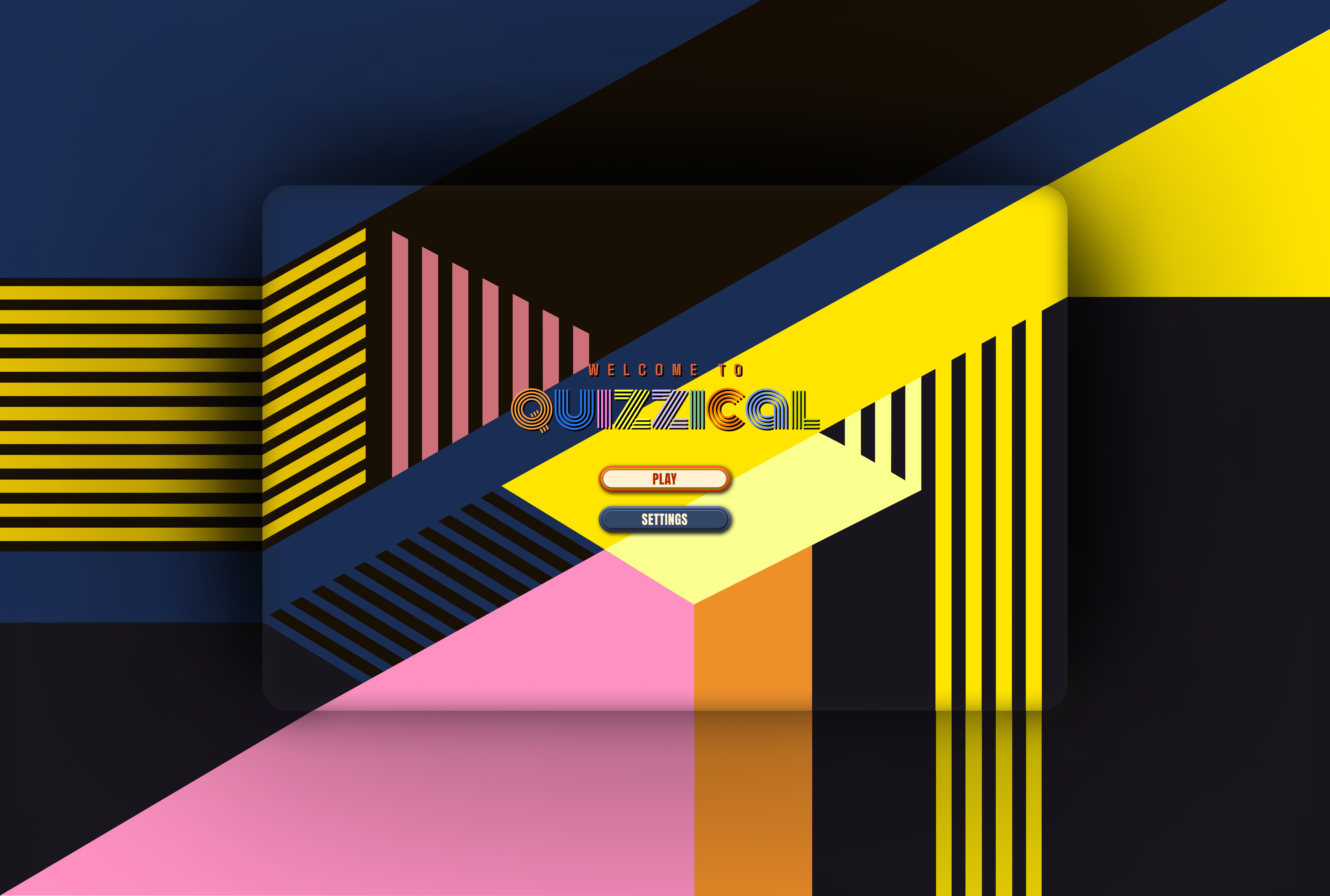
BACKGROUND
To align with the conditional rendering architecture, I designed a single background image to serve as the foundation for the entire game. This
choice ensures visual continuity, reinforcing the
seamless experience even as the interface changes. Since the URL remains
static, it was crucial to ensure that the design transitions felt cohesive, avoiding any confusion that might arise from appearing to navigate to
entirely new pages.
COLORS & TYPOGRAPHY
The background image served as the foundation for establishing the color
scheme and typography, setting the overall tone for the
design. The theme blends modern and retro aesthetics with vibrant and sleek elements,
creating a joyful and refreshing user experience. To enhance the playful
aesthetic, I thoughtfully selected a variety of complementary fonts and colors, carefully considering their frequency and relevance within the
design.
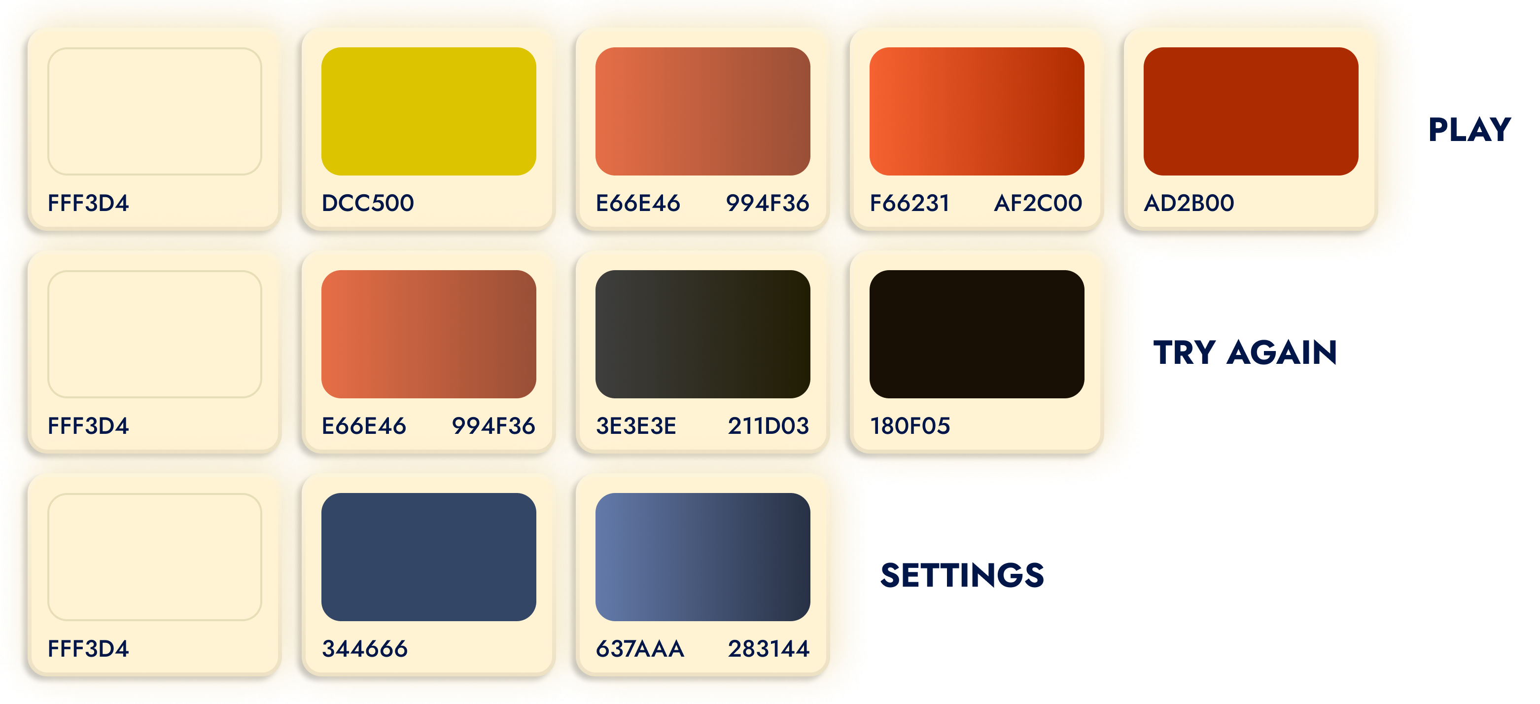
BUTTONS
The "Play" button, as the most important element, incorporates the
highest number of distinct colors. From there, I progressively reduced the number of colors used to maintain a clear visual hierarchy.
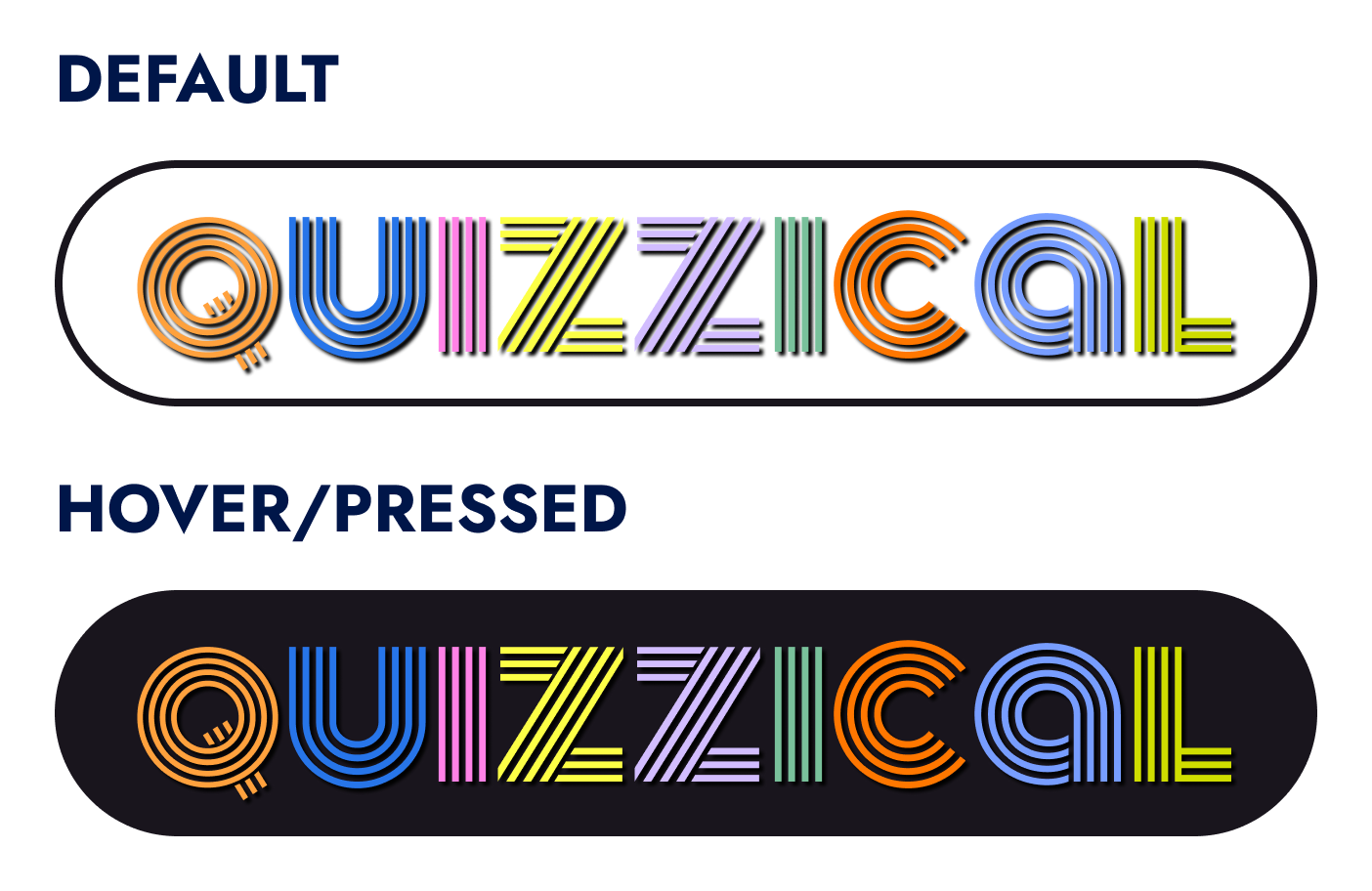
The logo features the Monoton Regular typeface with a custom
modification. To enhance readability and visual balance, the letter "Q" was
styled as an uppercase character but scaled down to match the size of the
lowercase letters. This approach was taken because the lowercase "Q" lacked
the clarity and coherence of the other letters, ensuring the logo remained
both distinctive and legible.
I envisioned the large logo being prominently displayed on the start screen, drawing inspiration from the bold, attention-grabbing designs of board
game covers. On subsequent screens, the logo was scaled down and made
clickable, serving as a consistent navigation element that
allows users to quickly return to the start screen. This approach balances
visual impact with functional usability.
For the typography I have chosen three different fonts,
each selected to enhance the playful and dynamic feel of the
game while maintaining clarity and readability.
COMPONENTS
To align with the playful theme, I designed each button
to be vibrant and visually distinctive, ensuring that
their unique functions are clearly communicated.
The rest of the elements maintain visual consistency through a cohesive color scheme, effects, and form, establishing a unified visual foundation. I incorporated a score tracker and a gradient timer bar, offering an intuitive, dynamic time representation that reduces cognitive load, enhances accessibility, and seamlessly integrates
into the interface.
This project was a rewarding challenge that pushed me out of my comfort
zone into the realm of game design—a field I had little prior experience
in. When my husband asked if I could design something for his front-end
capstone project, I excitedly took the opportunity. By following a
structured design process and focusing on one step at a time, I was able
to deliver a cohesive design more efficiently than I anticipated.
Additionally, collaborating with a developer enhanced my communication
skills and strengthened my adaptability as I navigated challenges that
arose during the transition from design to a fully playable game.

