Thriftstudio is an e-commerce website for a fictional local thrift store, offering an extensive range of clothing and accessories for men, women, and kids, from fast fashion to luxury brands.
THE PROBLEM
Users shopping in thrift stores often face frustration due to the lack of flexibility in shopping at their own convenience, missing out on discounts, and spending excessive time searching for items,
verifying sizes, labels, and prices.
THE SOLUTION
Design a responsive website to offer users a flexible and
fulfilling shopping experience from their local thrift store, with an additional
admin page for the thrift store’s employees, where they
can easily add, edit and manage the shop’s products and discounts.
discovering ways to enhance their shopping experience
understanding their difficulties with online shopping
identifying challenges they face while shopping in person
I conducted interviews to understand the users I’m designing for and their
needs. A primary user group identified through research was adults who
don’t have time to go thrift shopping. This user group confirmed initial
assumptions about thrift store customers, but research revealed that time
was not the only factor limiting users from going to thrift stores. Other
user problems included obligations, interests, or challenges that make it
difficult to go to thrift stores in person, or to catch periodic sales and
new arrivals.
PAIN POINTS
Working adults are too busy to spend time on thrift shopping in
person
Price, size and labels are often difficult to find or understand in
thrift stores
Not being able to keep up with discounts, missing them entirely or
best items being already sold
USER PERSONA
"I love the idea of thrift shops! I just wish I could rummage online."
PROBLEM STATEMENT
Romy is a busy student, who needs quick and easy online access to the thrift
store, because she doesn’t have time to thrift in person.
USER JOURNEY MAP
METHOD 2.
COMPETITIVE ANALYSIS
Some gaps I identified:
Competitor products don’t offer an online thrift shop linked to a physical store
Competitor products provide ordering only through an account
Wishlist, Cart and Filter features are not optimized enough for a fast and seamless shopping experience
Some opportunities I identified:
Building a responsive website for a thrift store,
where customers can see the
physical store’s actual products
Enabling quick, account-free purchases
Offering personalized notifications for discounts and
new arrivals based on filters saved by the user
Understanding who the users are, what they seek, and how quickly they can achieve their
goals was central to shaping the website’s structure. To achieve this, I prioritized presenting critical information and enabling multiple browsing options directly within the hero
section, ensuring easy access from the moment users arrive. My guiding principle
for developing the information architecture was to create a delightful user experience, catering effectively to the needs of both new and returning users.
SITEMAP
The following Sitemap outlines the main sections and pages of
the thrift store website. It is designed to prioritize easy access to key functions like searching for specific items based on previously saved filters, browsing inventory, and checking out.
USER FLOW
The primary path to browsing and purchasing a desired item from the thrift
store website
STORYBOARDS
The user flow provided a blueprint for how users navigate through the website to find and purchase products. The following storyboards illustrate this journey in a real-life context, showing how users interact with the platform and the environment in which
they are using it. While the user flow focuses on the interactions within
the digital space, the storyboards depict the emotions, motivations, and external factors that shape the overall experience.
SCENARIO:
A WEBSITE THAT ALLOWS USERS TO QUICKLY SHOP FROM THE THRIFT STORE ON THE
GO
I adopted a mobile-first approach in the initial sketching phase
to ensure an intuitive user experience starting with the smallest screens. By
focusing on mobile first, I was able to prioritize essential content and simplify interactions, ensuring that users would have
an efficient experience even in constrained environments.
I started with laying out the key features:
1
Info bar loop - shipping info, current discount info, opening hours
2
Men, Women, Kids - easy switch to preferred page
3
New in/Sales carousel
4
Sticky navbar for seamless mobile experience
5
Personalized filters info
6
Saved filters in the “Filters” popup
7
Option to view results or save new filter
8
Switchable Cart/Favorites page for easy access
9
Multi-editing products (share, favorite/add to cart, delete)
After finalizing the initial sketches, I transitioned to digital wireframes, prioritizing the key features. I designed both the primary and
supplementary pages to establish a comprehensive user flow, ensuring the
design was ready for user testing. I focused on three primary user tasks to evaluate the effectiveness of key interactions:
USABILITY TESTING
Goals:
assess whether users can successfully complete key tasks within the
prototype
evaluate the intuitiveness and usability of the prototype
Research questions:
what can we learn from the steps that users take to complete each
task?
are there parts of the user flow where users get stuck?
do the users find the filter saving feature helpful and/or useful?
are there design changes that would make each task easier and/or
faster for the users?
Tasks
Access your account and add a new shipping address
Create and save a filter for "Brown sweaters in size 38"
Used the saved filter to find a product, add it to your cart, and
complete the purchase
Usability test findings:
Participants found the Account menu overwhelming due to the numerous
subsections and the need to navigate back and forth
The radio button in the saved address section caused confusion, as its
purpose (indicating the default address) was unclear
Participants disliked that each filter section opened on a new page
slowing the process, and found the “Type” list confusing, as it mixed
product categories with options like “New in” and “Sale”
Participants suggested adding color names to the color selection for
better clarity
While the filter saving feature was appreciated, accessing it was
considered too cumbersome
Participants completed the checkout process smoothly but expressed a
desire to see the cart total on every checkout page
CHANGES
To address user frustrations with the account menu:
I redesigned the navigation layout, replacing the vertical scrolling
menu with horizontal scrolling, allowing users to access any section
of their account with fewer clicks
The saved address card was revamped by replacing the confusing radio
button and hidden menu with clearly visible editing options, enabling
users to edit, delete, or set a default address with a single click
The default address is now visually highlighted for added clarity
To improve the filters section:
I reorganized and divided filter categories to better align with
their content, making it easier for users to locate and customize
filters according to their preferences
Each filter category now uses a dropdown list instead of separate
pages, with added icons for quick open/close actions, along with
"Collapse All" and "Clear All" buttons for seamless navigation
I included color names to enhance clarity in the color filter
To improve access to saved filters, I separated them from the
filtering page, introduced a dedicated button on the product page,
and integrated them into the search function
ADMIN INTERFACE
The admin interface was designed specifically for desktop use to provide ample space for overseeing large amounts of information and efficiently
managing bulk product updates. I developed a mid-fidelity prototype to incorporate more detailed interactions, ensuring ease of use while accommodating various inventory management scenarios, such as editing, adding, and deleting products.
STYLE DEFINITION
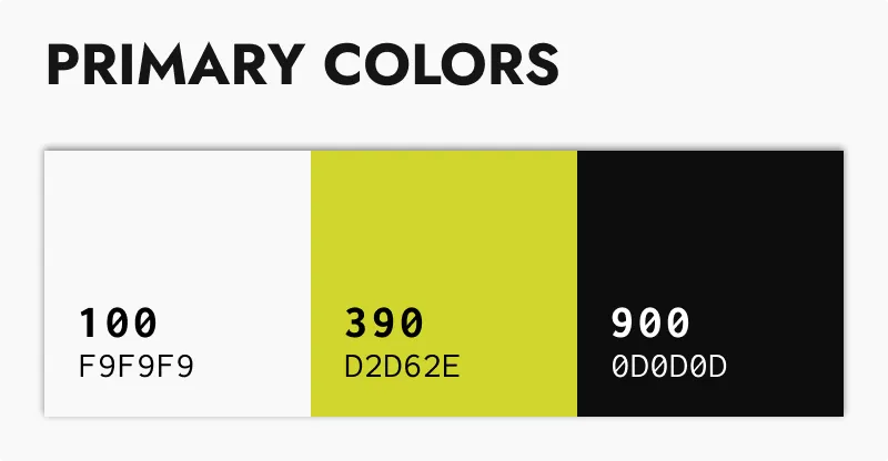
COLOR PALETTE
To establish an energetic and fresh vibe, I chose a bright, vivid lime yellow as the primary color. Its vibrancy is balanced with two neutrals:
an off-white for a light, airy feel and an almost-black for
a subtle contrast, creating a minimalistic and modern aesthetic. To complement this foundation, I incorporated a range of grays, greens,
and yellows, forming a cohesive and dynamic color palette that reinforces
a strong and consistent visual identity.
TYPOGRAPHY
To reflect the thrift store's diverse offerings, I aimed for a bold, expressive UI. I began with the logo, choosing the sans-serif font Staatliches for its dynamic and modern vibe. To make it stand out, I
modified the first and last letters (T and O) and the repeating T's by cutting
through them, creating an empty strike-through effect for a distinctive and edgy look.
As the primary font I have chosen Albert Sans, due to its modern aesthetic, legibility and extensive range of
weights and styles, providing flexibility.
To draw attention to specific sections of the landing page, I
incorporated a selection of sleek and distinctive typefaces, including Alokary, Allenoire, ITC Avant Garde Gothic, and Futura.
Each font was chosen intentionally to add character and enhance the visual hierarchy, ensuring key elements stand out while maintaining a cohesive and
modern aesthetic.
COMPONENTS
After establishing the color palette and typography, I designed the
iconography, illustrations, and components for all three viewports - mobile, tablet, and desktop.
After establishing the color palette and typography, I designed the
iconography, illustrations, and components for all three viewports - mobile, tablet, and desktop.
During the refinement process, I expanded beyond the initial wireframes, completing the missing pages - including Brands, Orders, Returns,
Settings, About Us, Delivery & Return Info, Contact, and Product Page -
and enhancing the desktop layout with additional elements
for a richer experience.
FINAL DESIGN
HOME PAGE
A key pain point was users missing out on new arrivals and sales
To solve this, I implemented three features:
a looping banner highlighting shipping, discounts, new arrivals, and
store hours
dedicated sections for men, women, and kids to enhance personalization
a hero section featuring a looping ‘New In’ and ‘Sale’ image, also
accessible via toggle, drag and swipe
On desktop, clicking ‘Men,’ ‘Women,’ or ‘Kids’ updates the landing
page content, while hovering provides instant access to all products
for seamless navigation
This feature is available via the hamburger menu on smaller devices
ACCOUNT
Hovering over the ‘Account’ icon when signed in reveals its subpages,
along with a ‘Hi, user email!’ message to confirm the signed-in status
and associated email.
Users can add multiple addresses and set a default, which auto-fills at
checkout while still allowing access to other saved addresses.
Users can customize their experience by adjusting preferences in the
Settings menu.
Subpages maintain a consistent structure across all devices, ensuring
users can seamlessly continue where they left off when switching devices.
HELP PAGES
On desktop, subpages are positioned to the left of their respective
content for easy access. On smaller devices, they are stacked
vertically and open one at a time, preventing excessive scrolling.
They can also be found in the footer.
PRODUCTS & FILTERS
To improve flexibility, users can collapse the filter menu, allowing for
better visibility of products while scrolling.
Additionally, the product list navigation bar remains sticky across all
devices, ensuring seamless and effortless product browsing.
Users need a quick and efficient thrifting experience - made possible
through saving filters.
CART & FAVORITES
CHECKOUT
The checkout process is optimized into two steps: one for entering
contact, shipping, and payment details, and a confirmation step for
users to review their information before placing the order.
Users can choose to check out as guests or sign in and seamlessly resume
their purchase from where they left off.
For users with multiple saved addresses, the ‘Contact’ and ‘Shipping’
fields auto-fill with the default address, but they can select another
via ‘Choose different contact’ for a smoother checkout.
Users can expand or collapse any field, including their cart, for
improved visibility, particularly on smaller screens.
The input fields offer real-time feedback with active states, error
messages, and icons for incorrect or missing information, along with
success indicators for completed fields.
ADMIN INTERFACE
The ‘Save’ and ‘Publish Changes’ buttons are disabled by default. The
‘Save’ button activates and changes color once required fields on the ‘Add
New’ page are completed. The ‘Publish Changes’ button updates when
products are added or edited and saved, providing constant feedback and
ensuring a clear and efficient process.
Existing products can be located via ID search in the ‘Products’ section.
Clicking an item opens a pre-filled ‘Add New’ page, allowing for quick
revisions.
This project deepened my understanding of how UI and UX work together to
create a seamless experience, how strong branding reinforces usability and
how thoughtful functionality enhances aesthetics. In addition, it
significantly enhanced my ability to design responsive layouts, prioritize
accessibility, and structure complex user flows tailored to diverse user
needs. Collaborating with a developer on such a large-scale project was both
insightful and rewarding, as it challenged me to explore new problem-solving
approaches, adapt designs efficiently, and navigate the full process of
transforming a concept into a fully functional website.
Moving forward, an additional round of usability testing would be beneficial
to evaluate the final design’s intuitiveness across different devices.
Further enhancements could focus on personalization features, such as
light/dark mode, a flexible landing page with editable sections, an
AI-powered chat assistant for product discovery, and expanded inventory
management options for the admin panel.
